 2010: Initiated as a global “mission-awareness media campaign” for the support and recognition of 10 projects across a 10-day period during October 2010, or 10/10, 10-Fold was a programatic tool for various social relief and church-related congregational efforts for its mission-based non-profit client, Global Ministries, and its sister agency, UMCOR, the United Methodist Committee on Relief. Each day during this 10-day effort, the focus turned to a different program covering topics ranging from global health to its agencies' ministry with the poor in developing nations.
A visually catchy logo-mark was needed for an umbrella program that was free of cues or visual references that might pigeonhole it with one specific agenda. Initially, an earthy green was employed in the logo to communicate its grassroots missionary premise, as well as the visual play of a fold-over effect in the first numeral.
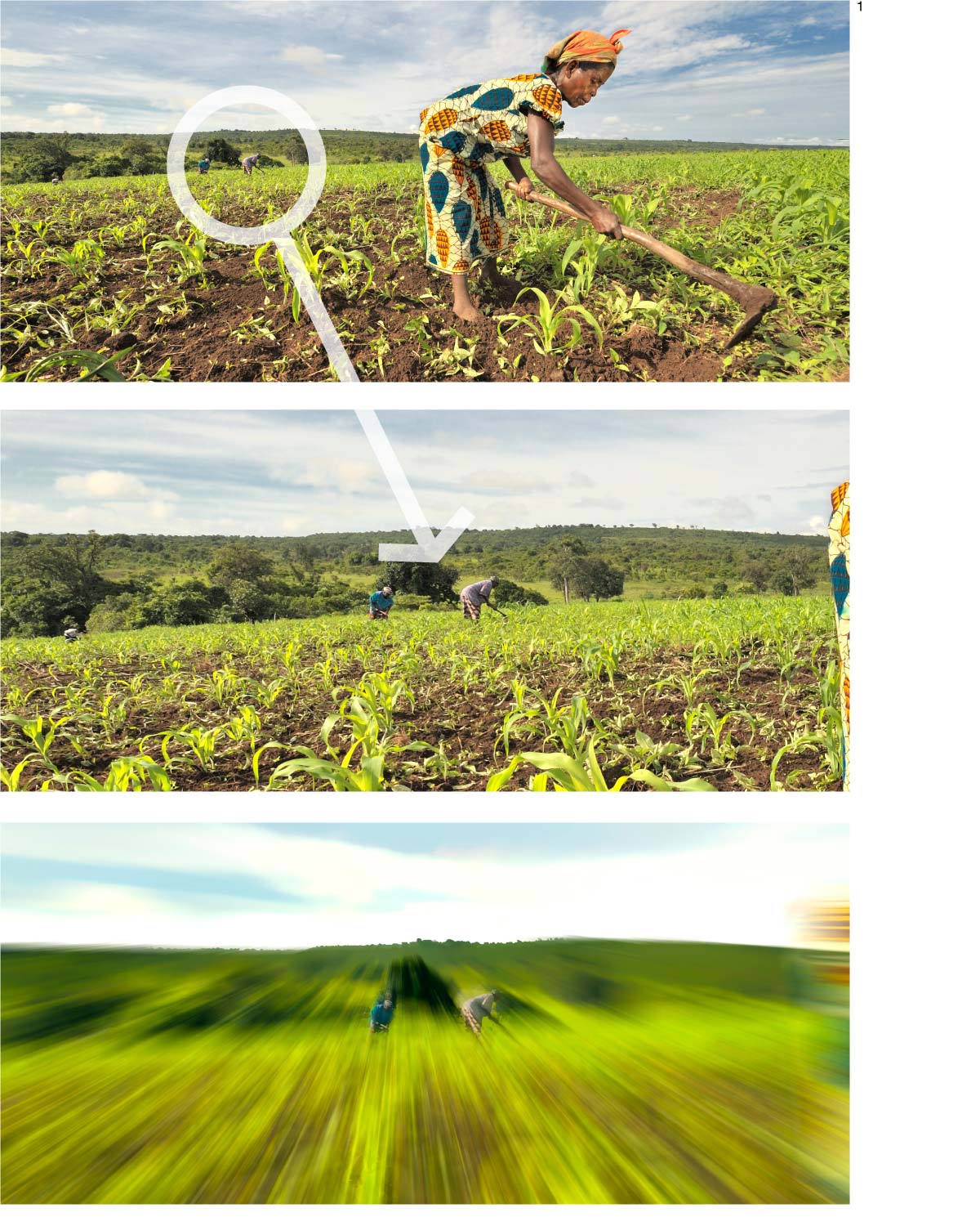 1. Since 10 Fold was a new program needing fresh branding and a fresh identity, some visual elements aside from the logo were needed as a consistent brand application congruent enough to accompany all of its individual programs. For a backdrop with palette cues, a portion of a photograph taken by one of the missionary-photographers was treated with a motion blur to convey movement and a dynamic inherent with the call-to-action basis of each of the programs. Some masking work was done to retain the forms of women working in the field — participants of an agricultural school sponsored by the agency teaching sustainable agricultural practices in the Democratic Republic of the Congo.
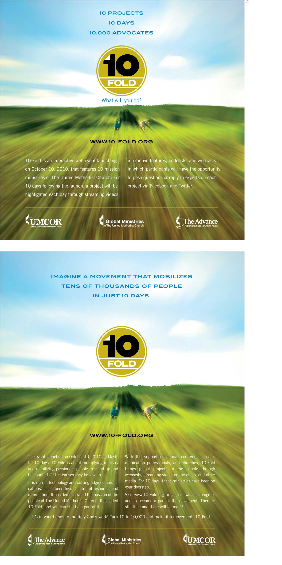
2. Shown is a pair of publication ads announcing 10-Fold with varying headline applications that ran in the preceding weeks. I required within branding standards that the logo, if floating over an image such as the treated field-worker photograph, couldn’t knock out over a dark background.
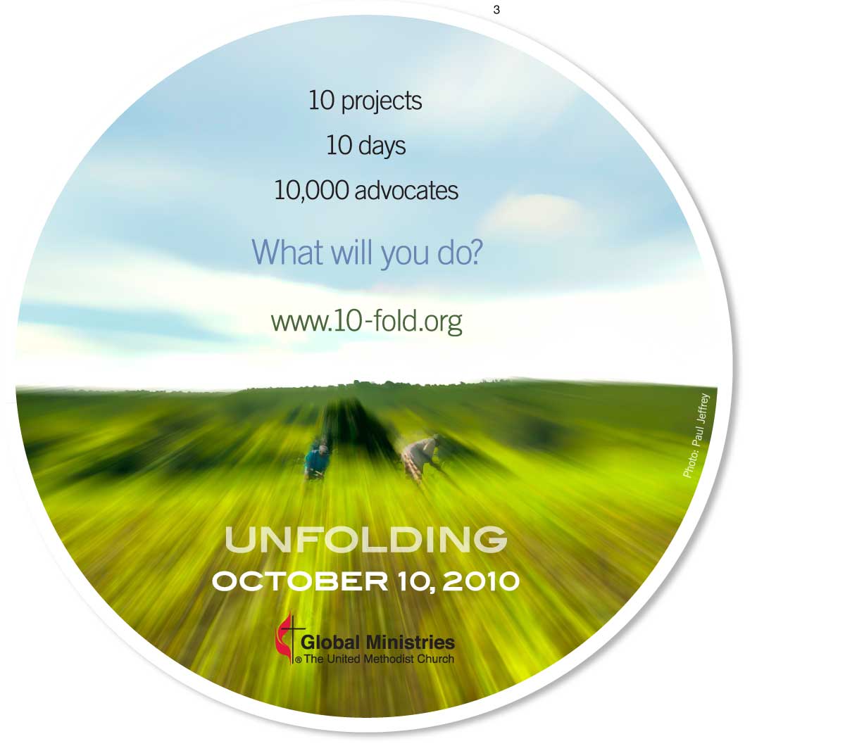
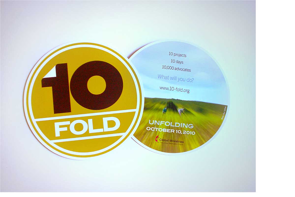 3. A flyer was the first glimpse most of the client-agency's constituents had of the logo, its branding and the program itself. Since the logo seemed to lend itself to a promotional handout of the same shape, a 6" round flyer printed on a coated card-stock was produced several weeks prior to its October 2010 launch. Both Blair ITC Bold and Trade Gothic Medium were typefaces elemental to the branding of both the program itself as well as the entire agency. However as the 10-Fold website and print ads were augmented, Blair ITC Bold became the face used primarily for headline and call-out elements.
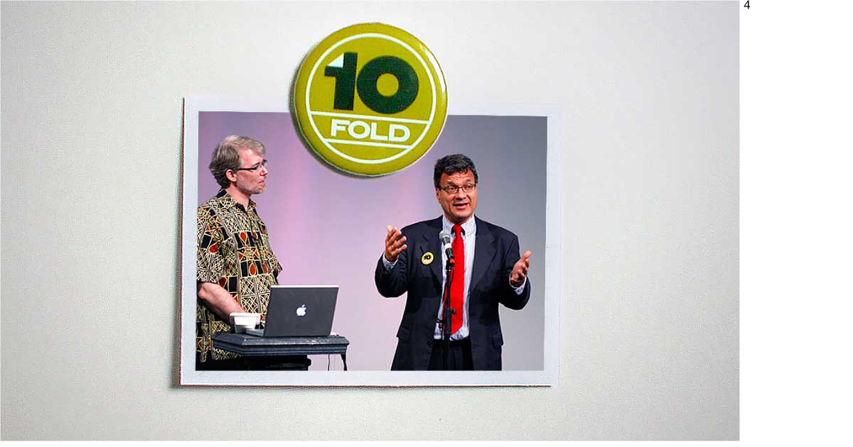 4. Promotional pins were also made for the campaign, as can be seen affixed to the lapel of the agency's executive director during its introductory webcast.
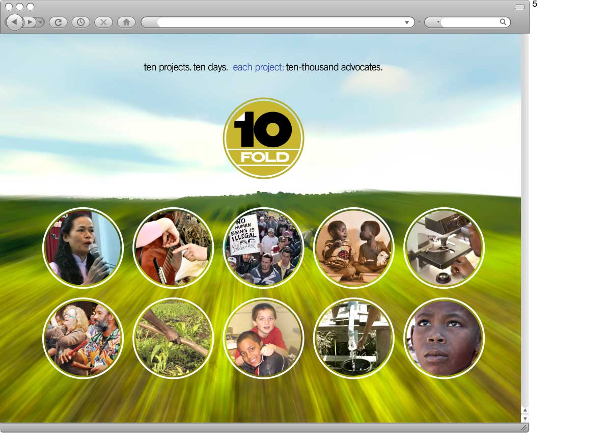
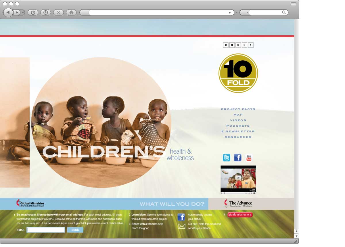 5. Initial layouts for the 10-fold.org website focused on its 10 specific programs and how best strategically the homepage's design would channel its audience and participants to each of them. As can be seen in a couple of the sample designs for the specific program landing pages, each page needed to accommodate a bevy of interactive features ranging from podcasts to streaming video fields.
Client: GBGM (Global Ministries)
Software: Adobe Illustrator; InDesign
Design Challenge: Create a branding system, and initially a logo-mark, with visual appeal capable of an applicable usage for an umbrella program comprised of many different causes.